Wise Sans
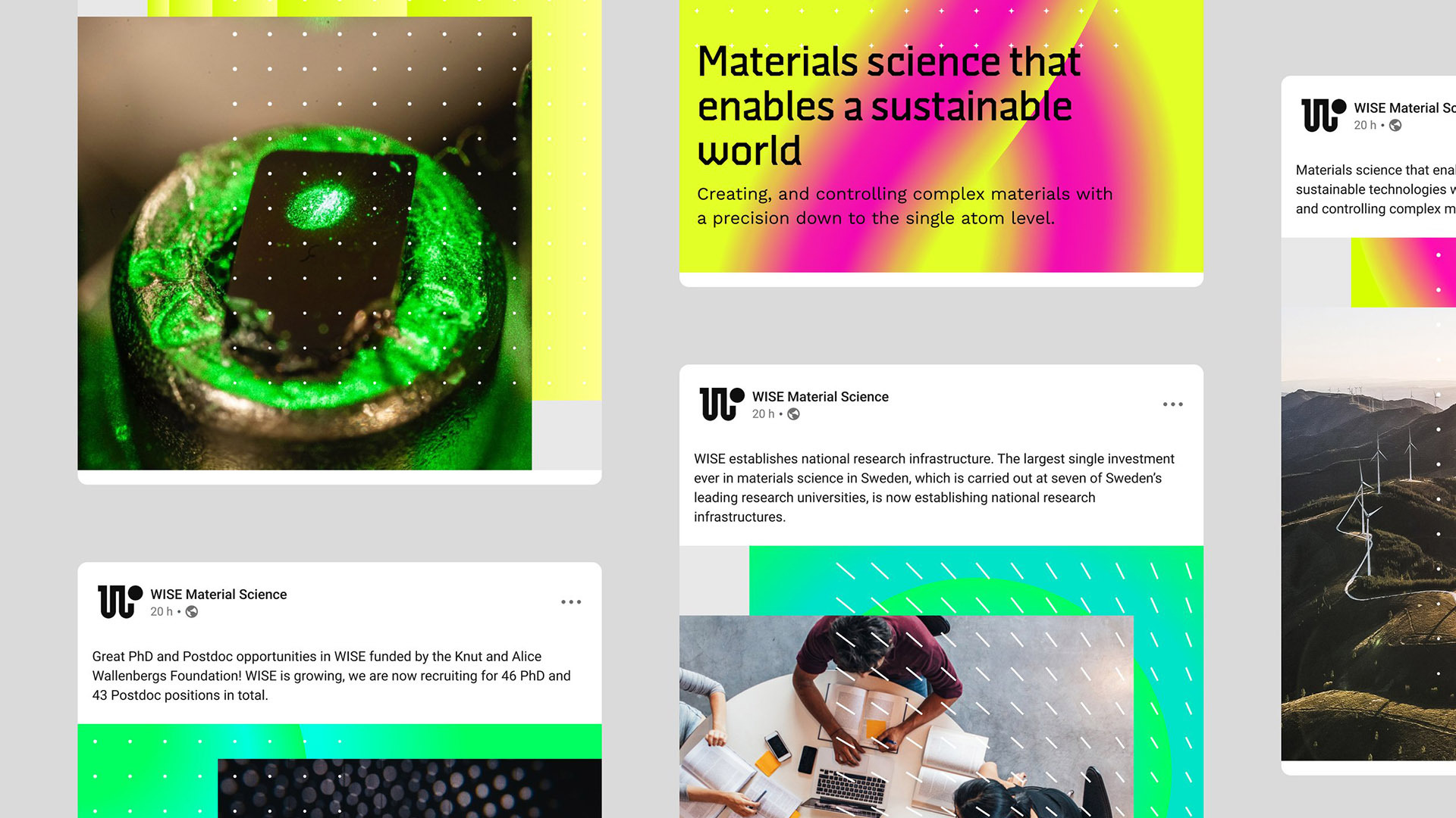
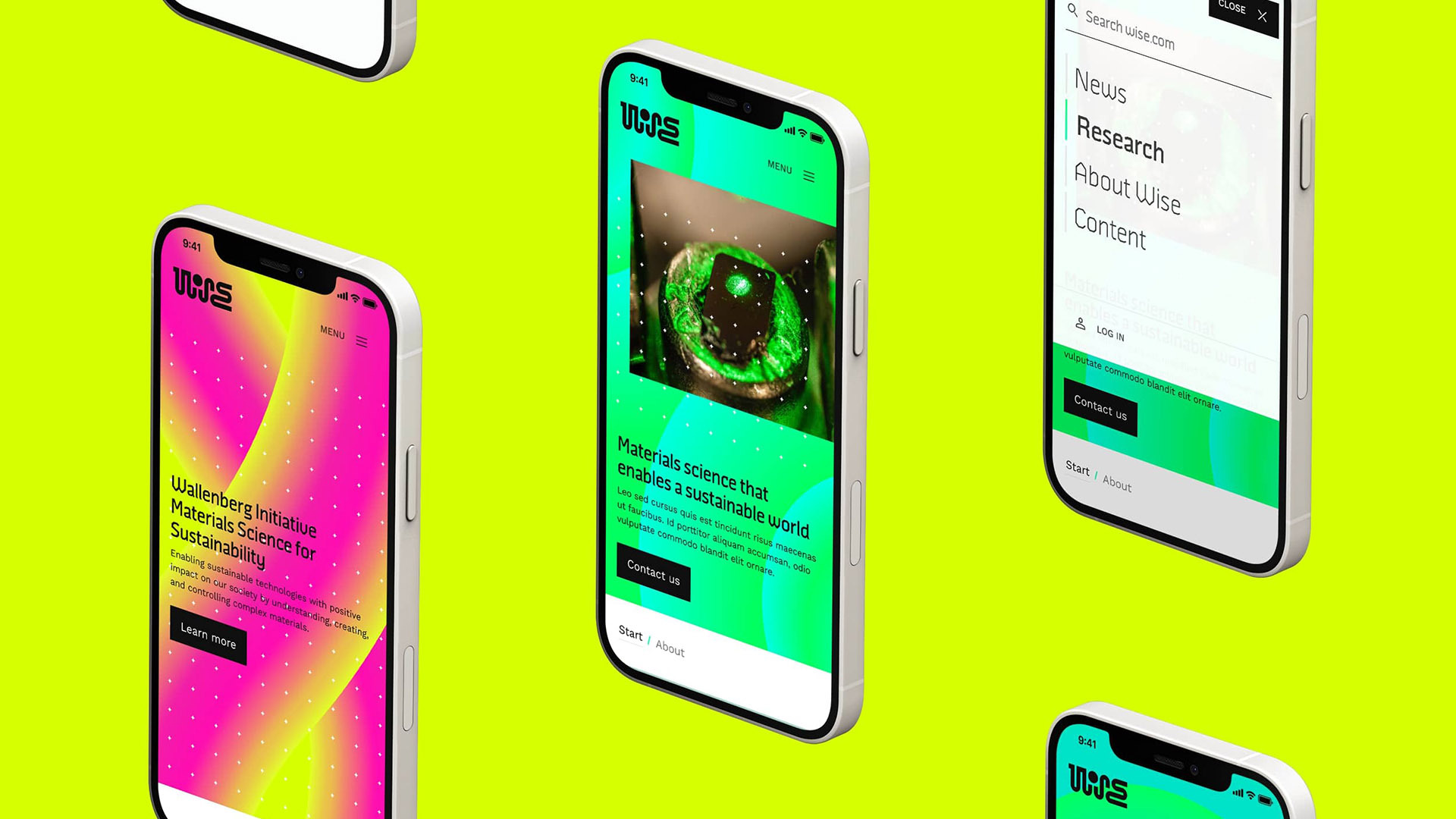
WISE stands for Wallenberg Initiative Materials Science for Sustainability. It’s a research program to enable sustainable technologies.
The custom typeface WISE was designed by Fredrik Andersson and myself as part of the visual identity by the agency Familjen.
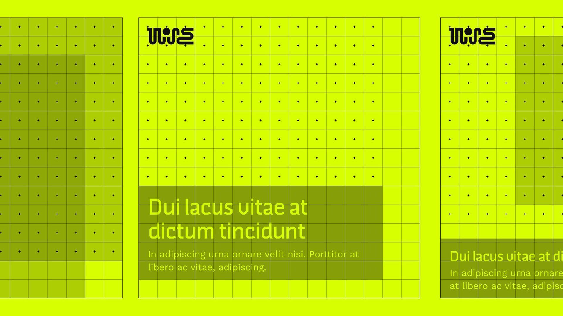
A dot matrix was used as a basis for various parts of the identity, including the fonts. The idea was to find expressive lettershapes within the strict constraints of this gridlike construction.
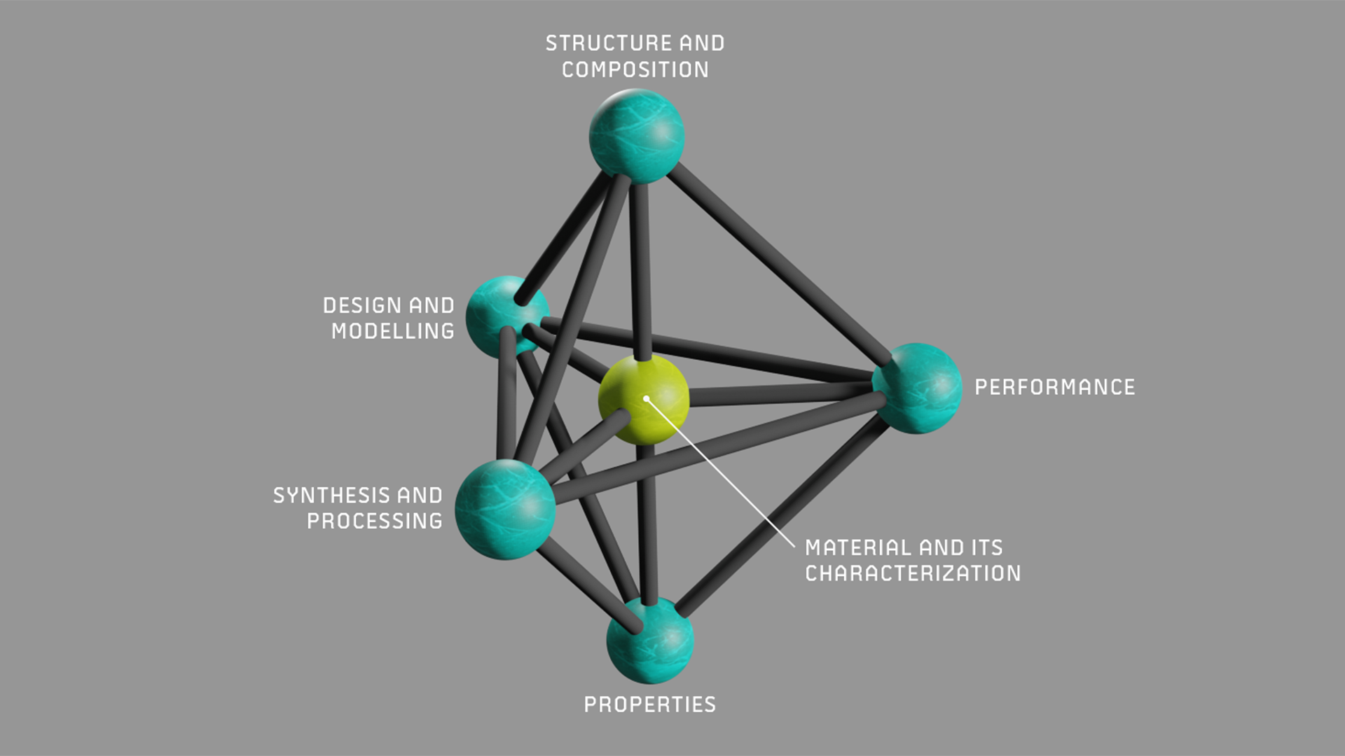
I also helped the client with some other design work, such as the 3d model shown in one of the images here. I don’t know much about 3d modelling to be honest, but really enjoyed working in Blender.
WISE comes in seven weights, ranging from Thin to Black.